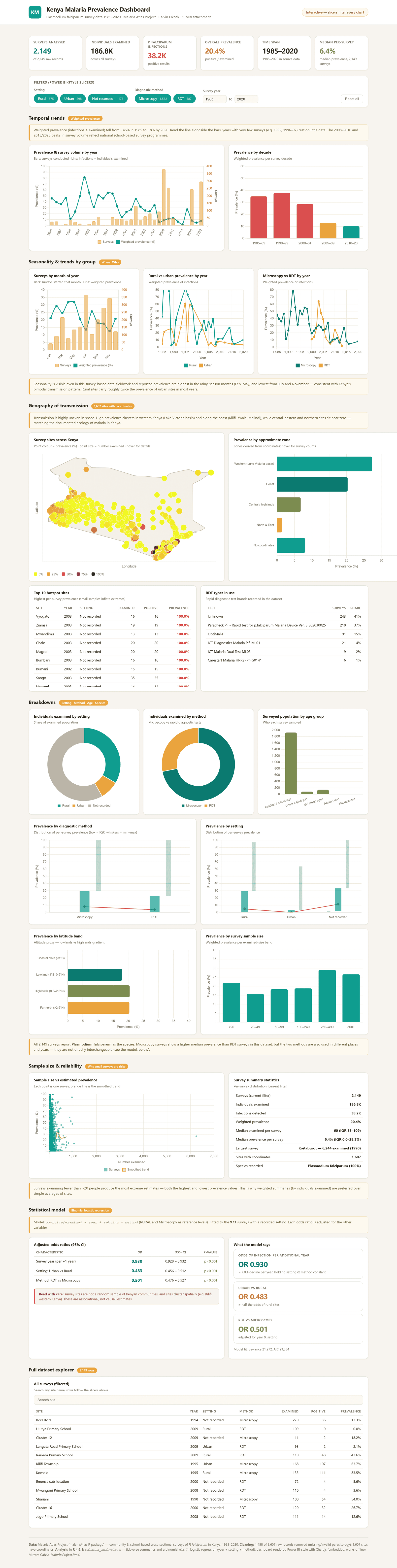
The dashboard provides a comprehensive overview of malaria survey data, beginning with key performance indicators showing 2,149 surveys, 186,765 individuals examined, 38,161 infections, and an overall prevalence of 20.4%. It visualizes temporal trends in weighted malaria prevalence by year and decade, showing a decline from approximately 46% in 1985 to around 8% by 2020. Additional trend charts show prevalence by month, differences between rural and urban settings, and comparisons between microscopy and rapid diagnostic tests (RDTs).
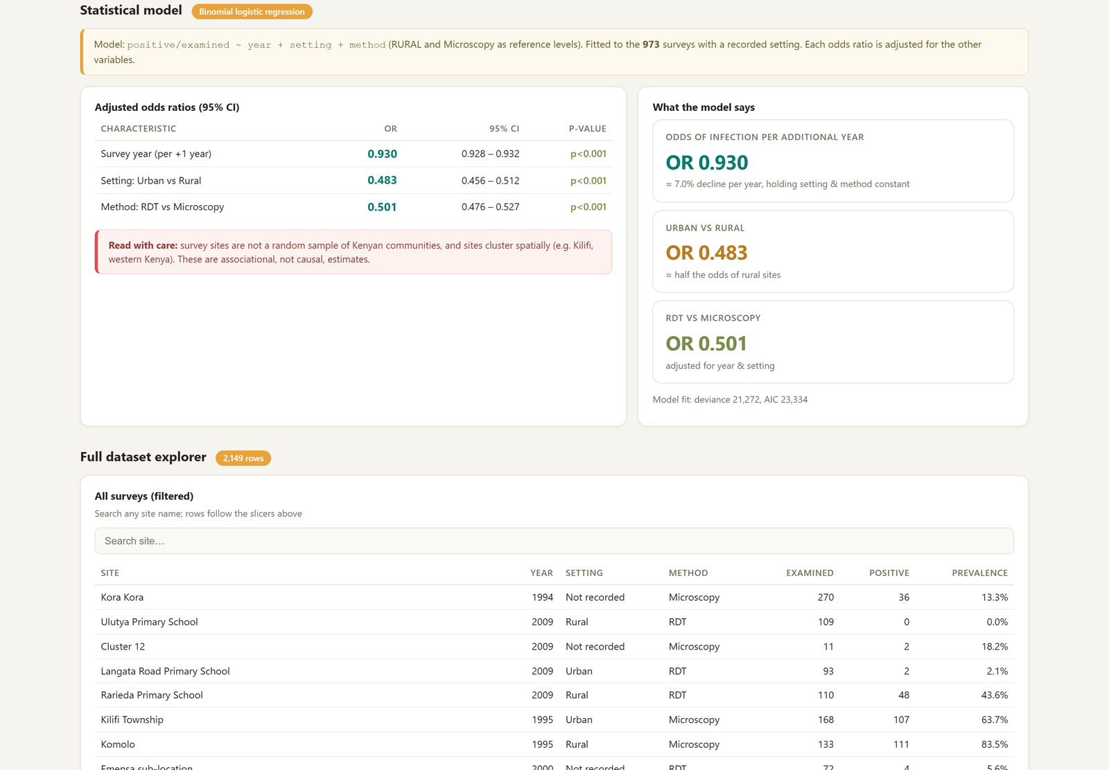
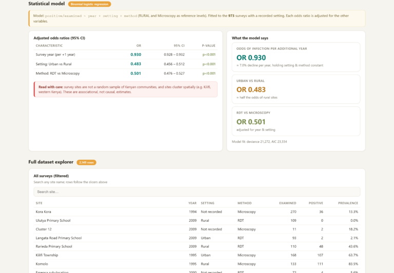
The dashboard also provides detailed geographical and demographic analysis. An interactive map displays all survey sites across Kenya, alongside prevalence by region and latitude band. Users can explore breakdowns by setting, diagnostic method, age group, RDT type, and malaria hotspots, while reliability analysis compares sample sizes with prevalence and provides statistics for individual surveys. The statistical model uses binomial logistic regression, showing a year odds ratio of 0.930, representing approximately a 7% decline per year, an urban odds ratio of 0.483, and an RDT odds ratio of 0.501.
Finally, the dashboard includes a searchable data explorer containing all 2,149 surveys. Power BI-style slicers allow users to filter the entire dashboard by setting, diagnostic method, and survey year, with every chart and the data table updating instantly. This makes it possible to move from a high-level summary of malaria trends to detailed survey-level information while keeping all visualizations connected to the selected filters.








Reviews
There are no reviews yet.